
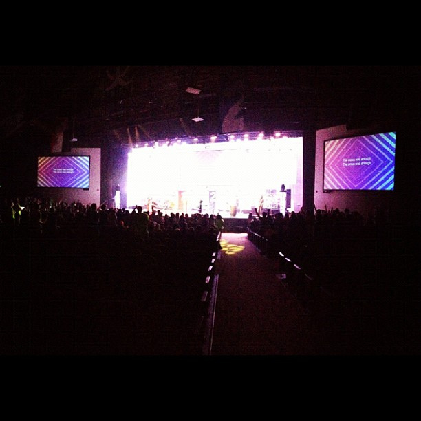


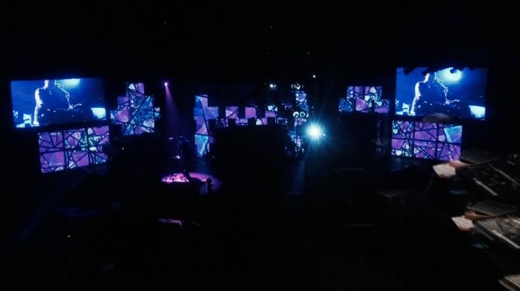
I know this is a little late, but I just came across this this picture tonight. This was our stage during our Memorial Day tribute. Now anyone who has ever browsed Digital Juice will immediately recognize these old school jump backs. This look was SUPER easy to make and at the same time it is probably one of the more effective graphics I have made lately. I really love the projection-on-projection look, and it is really easy to accomplish. It’s really just a funny layout of a triple wide projection, a double and a single instead of triple. Before I dive into the tech side of how this was done, the point I wanted to make here was this, sometimes simple is best. As in the title K.I.S.S (keep it simple stupid) As I said this was easy and it is probably one of my more powerful pieces.
For the tech geeks I will drive this a little further into details. We are doing this look with 3 projectors, ProPresenter, and a triplehead2go
The center screen and some of the truss are masked out in ProPresenter as well as the large gap under the screen. I don’t know that there is an easy way in ProPresenter to advance through masks (feature request/firmware update right there) so it was difficult to change the mask just for the Memorial Day look.
(WARNING TANGENT AHEAD)
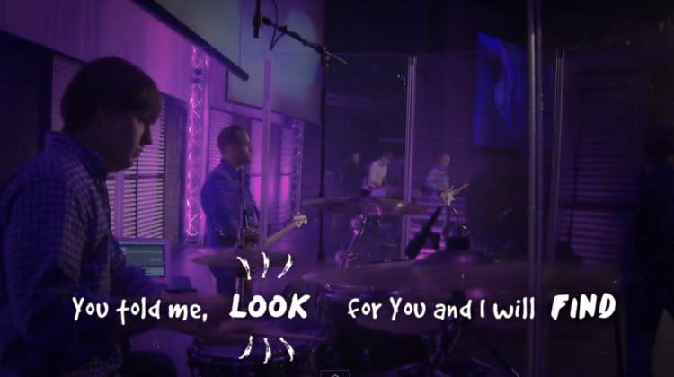
The reason that gap is there is because we hit that space with tons of light during the message to make the pastor pop off the background at out multi-site. As seen here.

We use lighting in the gap because the projected image alone in that same space is not bright enough, so in the cameras it looks washed out. Also the speaker blends right into it … so we use lighting at that gets us this result.
Now that red/yellowlight effect is coming from LED cyc light hitting it from the top and the bottom. We would have done just that to create the rock like look/texture, but it was easy to add the blue to tie it to the graphic above the pastor’s head.

(WE NOW RETURN YOU TO OUR REGULARLY SCHEDULED BLOG)
The cyc projection is stretched across projectors 1 & 2, along with the mask, the center screen is off of projector 3. This way I only need to change the right most 3rd to put something totally different on the center screen.

Projectors 1 and 2 are not edge-blended, they are edge butted. Since our edge blending is all done in ProPresenter, we couldn’t blend them without messing up the edge of projector 3, because it would have tried to blend the left edge of that image as well. Plus the seam is really not very noticeable because the majority of it is covered by the center screen.
The texture on the flag is coming from (I kid you not) mosquito screening. We zip-tied dozens of 48″x 25′ rolls along the long sides and crumpled them up and hung them over our white cyc.
Point of fact this was done for the series as a whole not just for this look. The series art was rock, as you can see in the tangent portion of the blog. The rock texture projected on crumpled mosquito screening looks really good. It also looks great with just lighting, but we don’t have enough cyc lights to cover our entire cyc.
We use noramly use one piece of triple wide content to drive all the projectors, on occasions like this I can change it up to a double wide and a single, by just changing the way the graphics are laid out in the design. Since the congregation is really desensitized to the content on the center matching the content on the cyc by purposefully mixing it up it really denotes something is different. Again this makes it real easy to be flexible and gives you another way to make some changes that really mark important times in the service, in a subtle yet powerful way.
No Comment